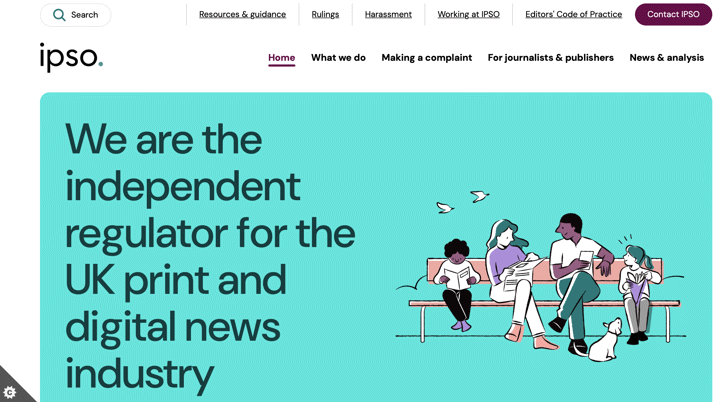
IPSO says part of its larger strategy of completing a brand overhaul in 2024, the project’s purpose was to improve engagement with IPSO’s audiences. The website is fundamental to IPSO’s work: it is the main route for complainants who are concerned about journalistic practice; provides access to the thousands of rulings that IPSO has considered since it was established ten years ago; it offers support for both journalists and members of the public with advice and guidance on editorial issues and journalism practice; it provides information about IPSO’s arbitration scheme; standards monitoring; harassment helplines and privacy notice service.
“IPSO’s website is a key tool in delivering our work to uphold the highest editorial standards and to hold publishers to account when standards fall short. The old website had become unwieldy for complainants and journalists who had a challenging time finding the information they wanted,” said John Davidson, head of communications at IPSO. “The new website is more accessible and creates separate user journeys for members of the public, and journalists and editors which makes for a better user experience. With a refreshed, brighter look, it is designed to help users find what they need as quickly and easily as possible.”
The new website incorporates refreshed brand colours, is livelier, and more welcoming, added IPSO.
Illustrations created by Yo Hosoyamada bring a new dimension to the look of the site. She said: “It was a pleasure creating the brand illustrations for IPSO. I wanted to express the different areas of IPSO’s work through illustrations that felt warm and accessible. Using textured linework and bold colour placements, the illustrations aim to create a set of visuals that feel friendly and welcoming with their quirkiness and tactile warmth.”
IPSO says the new website has been built for navigation across different devices and browsers, so users can access the site with ease through phones, tablets and desktop.
Christian Shannon, senior UX designer at Reason Digital, said: “As UX designer and researcher on the new IPSO website, I had the privilege of working on a project that plays a vital role in upholding press standards and protecting public interest. As part of the project team at Reason Digital, we worked closely with IPSO to ensure we understood both user and organisational needs. We started by conducting thorough user research to understand what our audiences needed, the insights of which guided us in creating wireframes, prototypes, and user flows that were intuitive and engaging. Our goal was to make sure the final website was both appealing and easy to use, enhancing the overall user experience and efficiency.”
“The new IPSO website looks great and is very easy to use’, said Andy Cowles, IPSO’s long-standing design consultant. “The graphics are warm and friendly – perfectly in line with IPSO’s brand values and workplace culture.”
The website features a new complaints form designed to support the user’s needs. Tonia Milton, head of systems at IPSO explained: “The new IPSO complaints form has been designed and developed to ensure that complainants are able to file their complaints quickly and easily which is especially important when they might be in a heightened state of emotions.”
Keep up-to-date with publishing news: sign up here for InPubWeekly, our free weekly e-newsletter.


