Q: How?
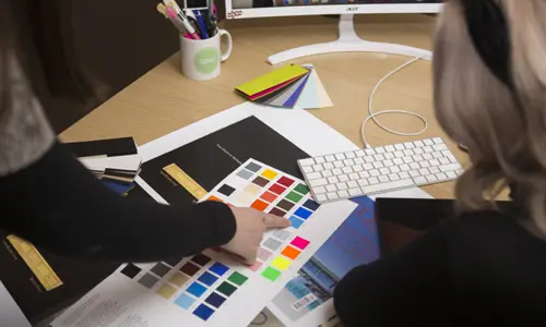
A: A professional publication should demonstrate an impressive design aesthetic, proficient writing skills and editorial prowess, comparable to the best in the industry. The design aesthetic should be consistent throughout and include: impactful covers with creative content that packs a punch, to capture readers’ attention; excellent and well-chosen images; high-standard infographics, where relevant; judicious use of fonts; consistent colour themes; a well-managed structure that presents information in a clear way; superlative use of design principles, in order to present information in the best way possible; and high quality writing, with editorial approaches that show that copy in the best light possible. Let’s take a look at some of these factors:- Images: Everyone knows a picture can speak a thousand words, so editors and designers should make images the way into layouts. Research shows that readers’ eyes are drawn to images first, much of the time. Beautiful, professionally-sourced photos and graphic images, carefully placed in the geography of pages, will create atmospheric focus.
- Design principles: Every decision on content and design should have the reader in mind, but editors and designers should be creative. Intelligent use of white space is an example of this. Make sure there is not too much text on a page — leaving space not only makes your design stylish, but also helps to draw the eye to content you want readers to focus on. Use these principles in spread format and go large with photos and imagery. Using colour sparingly, with a focused palette, can be more effective than a riot of colour.
- Fonts: Utilise font styles that are specific to your magazine genre. Use consistent fonts, weights and sizes, for example sans serifs for a younger, trendier audience, serifs for a more luxurious brand.
- Consistency: Create a theme and style synonymous with the brand — and stick to it. Use a consistent theme (eg. running headers, borders, folios) throughout. The reader should be able to recognise your brand and the way your pages look, and feel that they can trust your professional approach.
- Structure: The reader’s first port of call before they get to articles and features is the contents page: make sure it’s functional, highlighting key content and making it easy-to-find, therefore selling the content to the audience. Creating an attention-grabbing cover is key to selling what’s inside. Interiors should make sense to the reader, with a logical progression through different sections.
- Infographics: There is no better way to deliver complex content and text-heavy information than illustrating articles with infographics, helping readers to engage.
All these factors will engage readers and ensure they continue reading. In addition, they should increase subscriptions, as well as gain the interest of advertisers.
Q: What are your three top tips?
1. Use good designers! Consider outsourcing your magazine design as an alternative to employing in-house staff or using freelancers. Outsourcing can allow you to access design professionals with diverse skills and experience, who can bring new ideas and elevate the look of your publication. Utilising design contractors can bring innovation, fresh ideas and a new perspective to the publication. Experienced designers will have huge resources of skills and techniques. Making use of these could lift your publication high enough to compete with the best in the industry.
2. Pay special attention to your front cover: We all understand the importance of how your magazine front covers must captivate your readers and drive engagement. The cover needs to create curiosity about the content, and establish the magazine’s brand. So using the right cover images or illustration is key. However, do not neglect cover lines, placement, font choice and the design principles mentioned above.
The focal point of a magazine cover is always the main image or illustration. It therefore follows that if the content creator is unable to provide a large high-resolution image, use image libraries where you will find a large range of options from professional photographers. Remember to experiment: take creative risks — and don’t be afraid to go bold or make clever use of space!
3. Don’t skimp on proofreading: As the final stage in the production process, the editorial team will meticulously read every single word on the page, often spotting mistakes that have been missed. Proofreaders and subeditors will also check for consistency of style, casting an eye over layouts, making sure columns sit correctly, avoiding widows, orphans and word breaks, checking for alignment and ensuring a professional appearance. Investing in this expertise ensures issues that could be potentially costly can be avoided and a professional feel guaranteed.
Founded in 2008, CPUK Print Publishing was launched to work with and support specialist and independent magazine publishers. We deliver high-quality print publishing services to customers at any stage of the process — whether you are at the first stages of design and production, need some distribution advice or simply require your title to be printed professionally.
Web: www.cp-uk.co.uk
Tel: 01480 861 962
LinkedIn: www.linkedin.com/company/cpuk-print-publishing
Facebook: www.facebook.com/CPUKPrintPublishing
This article was included in the 'Celebration of Print' special, published by InPublishing in August 2025. Click here to see the other articles in this special feature.