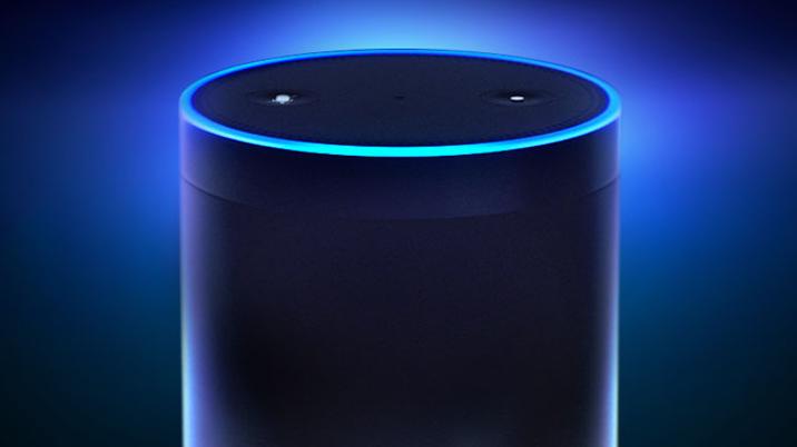
If you are following the SXSW Interactive Festival this week, you will have noticed that every other talk is around bots or intelligent personal assistants. With advancements in things like contextual search and AI, we are on the precipice of a great change in how technology integrates with our lives. With the rise of voice-controlled personal assistants, led by Apple’s Siri, Microsoft’s Cortana, Amazon Echo’s Alexa and Google Now, comes a fundamental change in the way we design the user experience for products, especially for publishers who are considering a print to audio offering. Here are some things to consider when creating a voice user experience (VUX) for Amazon’s Alexa.
1. First impressions
You have to make the user’s first experience with the skill as smooth as possible. This is true of all apps of course but a skill accentuates the need for simplicity. Not having a visual help guide or instructions means that this whole process must be stripped down to the simplest requests from the user (yes or no) while also being concise in language and not bombarding them with information. How you plan to monetise your product will also affect decisions at this stage; if you are planning to capture some of the user’s information, how will you do this? Using the Alexa companion app can really help here, as you can send a ‘card’ to the app with additional information such as a web link that drives a user to a sign-up page. If this were your model, creating journeys for subscribers, non-subscribers and lapsed subscribers must each be given very careful consideration.
2. Building behaviour
How a question is asked drives a user into the behaviour you want from them. For example, if Alexa asks, “Would you like to read more of this story?”, you will most likely answer “yes” or “no”. But if the question is, “would you like to read more of this story, or go to the next story?”, a user will usually pick up that they need to say something like “read more” or “go to next”. Knowing how to ask the right questions - and when - will be key to getting the answers you want or expect from the user. Another point to add is that although you want to drive behaviour, you must also try to avoid making the user feel like they are being railroaded down one avenue. They must feel like they can move freely around the skill. Which leads me to point 3.
3. Where am I?
The user has to feel that they have control of where they are in the skill. So, thinking about how they might return to the beginning, to another area of the skill or to a help guide is essential. Similarly, if the user is distracted while Alexa asks a question, you will need to use reprompts (the same question repeated in a slightly different way) to make sure they can continue using the app. You will even have to make allowances for the user to just go silent too.
4. How long is too long?
As you can imagine, it is far quicker reading text on a page than listening to someone read it out loud. Meaning a long read can really eat up time, although it’s also a great way to relax. The ability to pause, resume and skip suddenly becomes much more important. Generally, questions need to be concise; for example, in a recent skill, we tried Alexa reading out three different headlines and then asking which you would like to hear, but we found we had forgotten one of them by the time the question came around...
5. Real audio vs Alexa speech
If you are thinking of converting your publication to audio and the content is not time sensitive, you may want to think about using real audio instead of Alexa’s built-in speech. It can be a more similar experience to audiobooks or the radio for the user and they may find this experience more palatable. That said, Alexa does a brilliant job of reading and is improving all the time. The choice you make should centre around the best experience for your audience.
We are at an exciting time with wearable and connected home technology continuously improving and expanding. With this progress comes more and more integrations within Amazon’s Alexa, from turning on switches around the house to locking your doors and ordering groceries. Different types of content will be consumed differently while using smart speakers. For example, news headlines and opinion are useful to digest over breakfast each morning, while longer reads are more suited to Sundays in the armchair with a cup of tea.
Simplicity is your challenge to a good VUX, the fewest interactions between Alexa and the user to achieve the desired result is always the aim. After all, this shouldn’t feel like a questionnaire. Nobody wants to be interrogated endlessly by a robot.
The App Lab is a product development consultancy and innovation accelerator that helps publishers adopt the latest technology and explore strategic implications. The team works closely with software partners and technology platforms to help its customers achieve their goals and claim new markets.
The App Lab
Studio 7, Dickson House, Queen's Road, Richmond, TW10 6SP
Web: www.theapplab.net
Twitter: @teamapplab


