One of the most rewarding aspects of my job has been redesigning newspapers and magazines. My colleague Mike Brough and I have helped revamp more than 90 titles. One of the first was the Daily Echo in Bournemouth in the mid-nineties. I sent around 100 questions to editor Gareth Weekes covering everything from the titlepiece to the imprint.
We then produced pages based on the answers, printed them, put them on boards and presented them to Gareth and his team. His reaction was positive … looks great he said. But added: “Are there any more?” It was a pertinent lesson. That I liked it was irrelevant. The editor and his readership were all that mattered. Every redesign after that included variations – sometimes ten different front pages to be handed around, shown to readers’ panels and hung on walls. We would then carry out requested changes. It is fair to say we presented some designs that we didn’t like. It didn’t matter. It wasn’t about us.
One memorable comment from the editor of an international publication was: “I think it looks too interesting. Could you make it a bit duller?” We did. Fourteen years later, the paper implemented most of the changes we had given them. I guess we were just ahead of our time.
From broadsheet to compact
One of my favourite jobs was the Irish News. The redesign was introduced in stages to allow readers to become familiar with it before the shock of a size change. We went from old broadsheet to new broadsheet and let the readers live with it for six months before taking the design into a Berliner format. The Berliner is a midi size between broadsheet and tabloid, favoured by European newspapers. When The Guardian changed to Berliner in 2005, it was said to be the first time the format was used in the UK. It wasn’t. That honour goes to the Irish News although, as the chairman was uncomfortable with the term ‘Berliner’, it was referred to as a Euro.
Years later, we took the Irish News to a compact (tabloid was avoided as it had other connotations) and replaced its outdated slab serif titlepiece.
There was a flurry of redesign activity by the nationals too. The Independent published in broadsheet and compact formats at the same time (a time-consuming daily exercise) from 2003. It then adopted a sans-serif caps red masthead before switching to a vertical approach. The paper became online only in 2016. The Times also adopted the broadsheet / compact approach before going fully compact in 2004. The Telegraph, while sticking with a broadsheet, introduced many changes including a short-lived masthead for the Sunday. The Mirror went through a Spanish-influenced period before swapping to a cleaner look with Interstate as its display face in 2013. The Guardian changed again, going compact and changing its masthead, in 2018.
But since then, newspaper designs have been thin on the ground. The last major redesign work we undertook was almost a decade ago with the Inverness Courier and its sister titles, including taking the Strasphey and Badenoch Herald into the compact size. We also helped take four Northcliffe papers from daily to weekly. Since then, we have refreshed titles, introduced sections, produced regular live pages and helped launch a short-lived title, 24 the North’s National Newspaper, for Cumbria Newspapers.
Recent redesigns have been rare, although in March, Metro introduced a smart ‘gentle refresh’, including a vertical titlepiece, which gave the paper and the website a common editorial voice. It was also refreshing to see last autumn’s revamp of The Yorkshire Post which introduced new fonts, layouts, a different running order, new supplements and an emphasis on powerful images and positive stories.
Editor James Mitchinson explains: “We wanted to give the pages a better chance to showcase our best photography whilst updating our font family to one that is easier on the eye throughout thus making the reading experience more pleasurable.” The changes have made a big difference. The YP looks reinvigorated. So, Metro and the YP aside, why have redesigns taken a back seat?
- There is nowhere to go – after a flurry of moves to tabloid, what next? A4?
- The emphasis is on digital so all resources are diverted to getting stories up quickly, recording hits and producing videos, podcasts and the like. One regional editor says: “I was told I should not waste time producing content if it is not going to work online. They certainly don't want me spending time making my papers look pretty.”
- What’s the point? The changes are unlikely to bring in readers and may irritate those comfortable with the publication as it is.
- Budgets are tight and a redesign can be costly.
- Most of the regional groups use templates with one design, handled centrally. The same appearance is used across many titles so local teams can focus on content. If a newspaper, or family of papers, was to undergo a redesign, the templates would need to be redone … a massive undertaking.
Templating: pros & cons
Templating has brought about benefits but the downside is that a title’s personality can be diluted and editors take less ownership of the paper’s appearance.
Dr Michael Crozier, former associate editor, design, of The Independent, who has re-designed more than 50 titles, says: “The bottom has fallen out of the pure design market as a whole new generation of computer-savvy, if not design-savvy, journalists took over. There are no longer budgets for re-design out of house. The ‘fine art’ element of newspaper design has largely given way to template layout except for major stories. Great use of design, photography, infographics and typography has become a rarity.”
And Ric Papineau, former design editor at the Mirror, says: “Where does the impetus for a redesign come from? If multi-skilling and online has finally been the death knell of niche skills such as typography, colour palettes, features presentation etc then nobody is experimenting, trying out new ideas and showing an alternative to the existing templated product?”
Neil Benson, former editorial director of Trinity Mirror Regionals and now a media consultant, argues that templating has been a good thing. “I think the general standard of design in regionals is better now than 20 years ago. Maybe templating limits the ‘wow’ factor – for example, from a really well-put-together spread that’s been created from scratch – but it also prevents some of the horrors that used to happen all too frequently.”
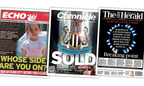
On the other hand, print needs to be nurtured. It makes most of the money and we need to give titles as much longevity as we can. I see some newspapers that have very strong front pages. Look at The Chronicle in Newcastle when the football club was sold, the Herald in Glasgow on the cost of living crisis and the Liverpool Echo when Olivia Pratt-Korbel was shot. All were deservedly highlighted in the Regional Press Awards. Gold standard. But I see other papers that look frayed at the edges, out of date and, worst of all, hard to read. I still see stories squeezed into pre-drawn shapes with meaningless headlines. So if you feel that your publication is due a makeover, but don’t have the budget, here’s a quick checklist to start the ball rolling in-house.
The key question
Why change? Are there parts of the paper that look outdated, has the digital offering left your print version in its wake, do we know what the readers want from print that they can’t get online? Is it longer reads, photography, nostalgia, analysis? Does the design reflect that?
- Page 1: Good design is about selling. We no longer use bill posters to persuade people to pick up our newspapers but the front page can still be a powerful draw for the casual reader. Does your blurb tease and entice? Is your splash eye-catching or is your front page cluttered? What about the masthead? Some historical ones have stood the test of time but those designed in the last 30 or 40 years might need reviewing.
- Typography: When was the last time you reviewed your fonts? Is your body type readable for your readership? There are modern and inexpensive fonts so you can be readable and up to date. Are your column widths easy to navigate? Is your headline face weary? Is it too windy? Does it allow the headline writers to tell stories or force them to use dull words to fit? The headline font is part of your brand so change it with care. But fonts also date quickly. Cooper Black went from the coolest font on the planet to being used on the credits for Dad’s Army. I wrote in more detail on typography in InPublishing here.
- Artwork: I see some newspapers where the section headers, the picture bylines, the logos and other furniture look 25 years old – in many cases because they are.
- Structure: Does your structure reflect the readers’ interests or is it historical – news at the front, comment and letters, features, business and TV, with classified forming a bridge to sport? With digital media breaking the news, is there really a difference between news and features? Should the running order reflect the readers’ priorities?
There is more – colour, white space, images, graphics, rules and borders, captions. Look at the way each is used and if they are doing their job, move on, if not, look at ways to address them.
Design may not be high on most editors’ priority list. But the way we look needs to keep evolving and our appearance can become outdated very quickly. If you need a regular reminder, I can send you a photo of me, in flared loons, platform soles, a tie-dyed grandad shirt and, believe it or not, a Jimi Hendrix hairstyle for your screensaver.
This article was first published in InPublishing magazine. If you would like to be added to the free mailing list to receive the magazine, please register here.