“The reports of my death are greatly exaggerated.”
The words were author Mark Twain’s when asked about a mistakenly-published obituary in, of course, a newspaper (although he was misquoted!).
Daily city papers were once the titans of the regional publishing industry, vast enterprises churning out multiple editions and read by… everyone.
Ok, they are not that now – but they’ve not vanished.
At National World, we still sell many thousands of daily papers in cities across the UK.
(The operative word in that sentence was ‘sell’ – yes, crazy idea digital kids, but people are parting with serious cash for our printed content, habitually and daily.)
Like other regional publishers, we are a digitally-focused business, but print is still very important – and we need to make it work for our readers, whose needs are changing.
Back in January, our executive chairman David Montgomery issued me a hefty challenge: “Reimagine the daily city newspaper for a modern reader.”
So, we pulled together print teams into a daily press division, appointed a managing editor – my redoubtable colleague Neil Pickford – and set about it – relaunching our titles in Edinburgh, Portsmouth, Sheffield, Leeds, Preston, Blackpool, Sunderland and South Shields.
It’s been a fantastic process for everyone involved and here’s what’s gone into it:
1. How readers are changing
The internet has changed everything, obviously.
I’ve written before in InPublishing how attention spans are shortening, scanning and skimming are becoming the dominant modes of reading behaviour and how information must be presented in chunked-down easy-to-digest packages.
It’s not just words which are important – our pages have to be a visual feast to arrest the eyes and stop people flicking on to the next thing.
People will read longer pieces, but they have to be really engaged, so our ‘books’ have had to become a mosaic of different story lengths and presentational devices.
And print long ago lost the battle for breaking news to the 24-hour rolling update you keep in your pocket.
What readers want from print now – especially in daily papers – is something more… it’s depth, it’s analysis, it’s perspective.
It’s what you don’t get on social media!
I’ve recently learnt a lot from the digital content theory of ‘user needs’ (championed by Dmitry Shishkin) – greater engagement comes from offering greater background, education around issues, solutions rather than relentless bad news, plus distraction and FUN!
It’s equally true for the needs of print users and we have brands with long, long histories and great authority so it should be second nature to us.
2. The new feel to our stories
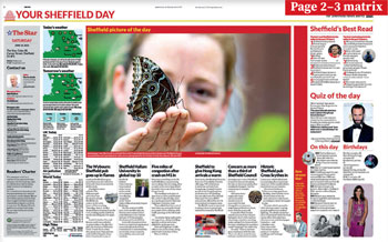
Our relaunched titles have matrix and digest presentations, summary pages of what’s happened this week and diary notes of what’s coming up in the next few days.
The print teams edit and re-edit the content from our digital writers into different formats, such as Q&As or ‘Five Things to Know About’ or stories in lists of numbers.
These Alternative Story Formats are fixed permanently into the running orders alongside longer reads to ensure a variety of reading speeds and rhythms.
They go beyond the age-old ‘inverted pyramid’ narrative structure – just as the language of the internet has – to tell stories in non-traditional ways.
Our print teams are not just taking pre-published digital content and slapping it into a template – they make conscious choices about the best information for our readers and curate it into the best possible format to ensure maximum engagement.
We use templates, of course, but only the very best created by our design genius, Duncan Jackson. He’s spent more than a decade translating visual concepts into eye-popping replicable page frames which are populated over and over, looking different every time.
3. The visual language
Did you know, you remember 80% of information explained to you in pictures, as opposed to 20% of the words you read?
And if you’ve read this article to this point, rather than just looking at the pictures, well done – you’re in the minority.
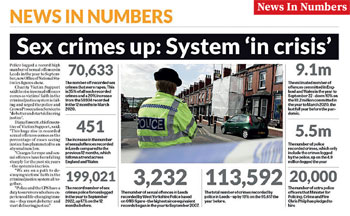
Our new-look papers feature lots of visual ‘devices’, old favourites like factfiles, pull-quotes and sidebars alongside number boxes and graphical data visualisations.
The graphics aren’t just there to illustrate data-based stories – they can be the entire story.
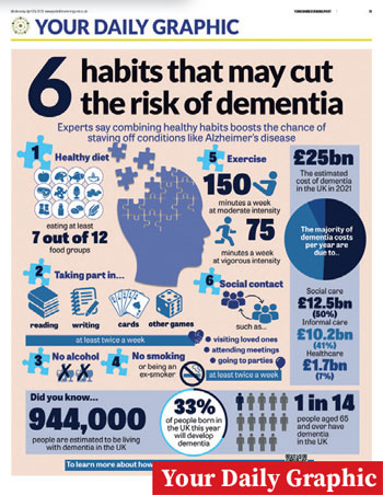
Every day, our design team led by John Clerkin creates a full-page graphic for our eight titles which explains a news story, a social issue or a leisure activity relevant to our target audience – be it how to spot the signs of dementia, how much food prices are changing, or even how to make the UK’s most popular cocktails.
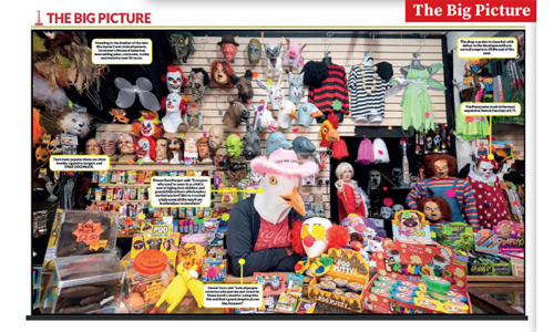
And, each day, we publish a picture from around the UK or the world across the centre page spreads.
A showcase for great images, we overlay the pictures with explanation captions, some pointing to specific details in the image.
We think this ‘Big Picture’ feature has the power to engage readers far longer than with 800-1,000 words of text.
And it’s something you can only enjoy in print; a double-page tabloid spread pic has a much richer experience than the six-inch phone screen version.
4. The sporting life
Football is still a huge sales driver for daily city titles.
We saw this summer how the ups and downs of the Leeds, Sheffield and Sunderland teams fascinated readers who want the minutiae of detail.
But our presentation of this most dynamic of subjects had become, well, boring.
And by the time it reached the reader, out of date.
In our new world, gone are the traditional blow-by-blow football match reports (which very few people read online), replaced with statistics and background analysis, the content we know drives huge amounts of digital audience, and exciting imagery.
Set piece designs by our teams use a blend of cut-outs and graphical devices to reflect vigour and the fans’ excitement of sport.
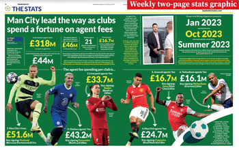
Our designer, Michelle Kilner, does a weekly two-page stats graphic for all titles which is a thing to behold – movement and dynamism jumping off the page.
Our daily ‘World of Sport’ two-page spread adds a digest of everything that’s not football to the mix, with some of the best sporting pictures from around the world from the wires.
We also promote back to our national football site ‘3 Added Minutes’, hosting a daily column from them with a slightly askance look at the world of football.
5. Distraction pieces
Often, the best-read stories on our websites are not the hard crime, local issue, fierce debate fare you might associate with city daily papers.
It’s stuff like, ‘The 10 Richest Celebrities from Leeds’, ‘The Biggest Rock Acts to Come Out of Sheffield’, ‘The Most Expensive Properties in the North West’.
You know the kind of thing, because you probably read it.
Rather than turn our noses up at this, we embrace it, with specifically-designed templates to accommodate the story forms and set places in every book every day.
We have a set page in every title each day for content from People World, our national celebrity gossip site.
There’s still a lot of serious stuff in our papers, but those clicks can’t be wrong – people want to be entertained and distracted.
We also have a lot of leisure: what to do, what to watch, where to go, where to eat; it’s short form recommendations to guide people through their weekends.
And everyone in the team (including me!) contributes to the ‘What I’ve Been Watching’ daily TV page, because that’s what our readers talk about.
This isn't your standard TV review of the latest shows – it’s likely to feature Sue Wilkinson’s fascination for daytime reruns of ‘The Sweeney’ or even my decade-long addiction to ‘Ramsay’s Kitchen Nightmares’.
6. The QR code is… back
Our print and online audiences are definitely different, but there’s a clear overlap.
Remember QR codes?
We used them in print back in 2010 before they vanished.
Thanks to online menus during the pandemic and much better smartphones, they’re back!
Now you’ll see them littered throughout our pages pointing people to more content online.
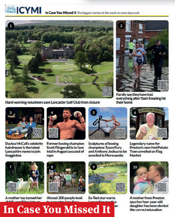
Our ‘In Case You Missed It’ page is a round-up of the best-read online stories from our companion websites. These may not have made it to the print edition, but if you want to read them, just scan the QR code.
Same goes for breaking news, football headlines, celebrity gossip, and special interest content, such as property sales listings – get your phone out and scan for more.
Our digital teams produce more and more video now, so how about a video page in print?
This features frames from our best-watched videos, with short summary captions. Readers can either get everything they want from the digested print version – or use the QR code to jump straight to the video on their phone.
7. Brightening the outlook
Wherever you live, you can either think it’s great, or it’s a dump.

We’ve decided the daily agenda for our city titles is to celebrate how fantastic life can be in our cities – how they’re vibrant, dynamic, developing and fun places to be.
Crime and grime stories were once an easy option for daily titles, because they just walked in the door.
We’ve kept the important ones, but they’re way in the back of the book.
At the front, you’re much more likely to find coverage of real people doing great things, great shops and restaurants opening in the high street, readers having a great time at parties, all the good stuff of daily life.
It’s like this: Would you rather spend every day with someone who told you how everything was rubbish – or someone who was fun, engaging and looking to a bright future?
You know the answer.
This article was first published in InPublishing magazine. If you would like to be added to the free mailing list to receive the magazine, please register here.