Magazine front covers are a legitimate late 20th century art form. Alongside the advent of photography, rock music, and the video game, they are unique expressions of how we see ourselves in relation to the world.
Joni Mitchell sang of “pretty people reading Rolling Stone, reading Vogue”. Andy Warhol got his start illustrating for Glamour, Mademoiselle, and Esquire. Paul Smith’s clothes shops have piles of The Face lying around and NME on the walls. Covers are Art.
Generalist front covers work by allowing the reader to access a part of themselves that might otherwise be hidden. Broadly relatable content allows anyone to see themselves reflected in it.
So, if I’m looking at Vogue, I’m in touch with the part of myself that values beauty and quality above all. If I’m looking at The Big Issue, I’m in touch with the part of me with a social conscience.
Making people feel a certain way by looking at magazine covers, either on paper or as a digital thumbnail is quite a feat. It might not be an actual magic trick, but it’s not far away.
So where does this leave specialist magazines? Can Professional Pensions, Amateur Gardening, or British Plastics and Rubber magazine covers be considered an art form too?
Of course they can. Their readers are no less important, and their attention no less valuable. That said, specialist audiences are different in one important respect. They don’t need to look at Harper’s Bazaar or GQ for reassurance, because they already know who they are.
The challenge with a specialist magazine cover is not to get readers to assume a new identity, but to feel good about the one they already hold.
Here’s how to do it:
1. Say who you are
It helps if your title contains a definitive article — The New Yorker, The Lady, The Country Smallholder. Or that your title ends in ‘er’ — Puzzler, Sea Angler, and so on. (Having Googled it, I can tell you that an ‘er’ ending is an agentive suffix, describing someone or something that performs an action).
But many specialist titles are named around the content. So, what do we do about that? However weird your magazine name may be, it’s all about your logo.
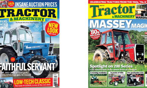
The opportunity is not only to identify your title, but to demonstrate your values. The recent redesign of Kelsey’s Tractor & Machinery is a case in point.
The tractor market is big. Lots of smaller titles, but Tractor & Machinery fight it out with Classic Tractor for pole position.
Their old logo looked dated, and its tabloid position made it feel cheap. But it had valuable features that needed to be kept. The yellow panel delivered stand out. Black and green delivered a practical, earthy feeling. And curved type gave a sense of heritage.
So, the redesign takes advantage of The One Thing that distinguishes the title in the sector — ‘Machinery’.
The new font is muscular. And ‘Machinery’ is now an integral part of the mark. Everything is now seen through the prism of reliable machinery. Unlike those chancers over at Classic Tractor.
These values were then pinned down by our new line under the logo — ‘For people who know their tractors’. This positioning makes clear the title has a deep well of expertise. But it also de-positions Classic Tractor, by suggesting those readers don’t know their tractors. That they don’t know one end of a spanner from another.
2. Identify your reader
Tractor & Machinery now make a point of describing the tractor as if they were describing a reader.
The tractor is self-evident. What’s more important is for the reader to see themselves reflected in its qualities.
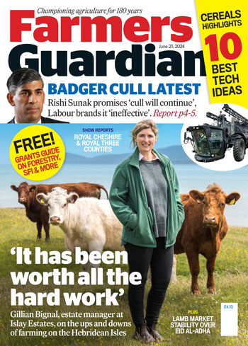
The new Farmers Guardian cover has also positioned around audience identity.
Farmers Guardian is strong on livestock and the north. Their big competitor is Farmers Weekly, which is strong on arable and the south. So, to increase market share, the cover strategy is to reach out to all farmers by empathising with their sense of identity.
It’s still a news-driven B2B, but instead of galley text, the cover canvas is now big pictures of real farmers doing real things. Making them look like the superheroes they are, photographer Marcello Garbagnoli is the secret weapon. If you’re a farmer, you’ll see your hopes and dreams reflected in his pictures better than any others.
3. Explain what makes you different
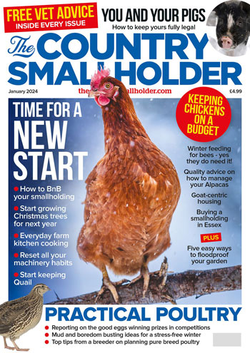
Country Smallholder may have no direct competitor, but it still needs to establish its value. And whether it’s about chickens, sheep, or goats, the one thing all country smallholders agree on is the shocking cost of a vet.
Powerhouse editor Liz Wright has many vet columnists. So, the cover can be built around one ever-present item — ‘Free Vet Advice In Every Issue’. It’s always top left, and it always pops.
After that, the lines are focused. ‘Goat-centric housing’ offers clear authority. ‘Floodproof your garden’ is welcome advice for new readers. And we also take the Cosmo principle of mentioning ‘you’ and ‘yours’ as many times as possible. In this case, ‘You and your pigs’.
4. Deliver a Big Fat Promise
Country Smallholder might lead with ‘Time for a new start’, but this is just a framing device for the lines that follow.
The Big Fat promise comes from an overwhelming sense of value. Victoria Beckham was clearly convinced, as she bought an issue for David as a Valentines gift. And then shared that news on Instagram with her 8 million followers. Personally, I think it was ‘How to buy a Smallholding in Essex’ that caught her eye...
With Farmers Guardian, is the empathetic quote on the picture the big promise, or is it the punchy line about badger culling? The answer is neither. The promise is a careful blend of six solid reasons to buy, alongside the pictures to prove it. Even the smallest lines deliver a knock-out punch.
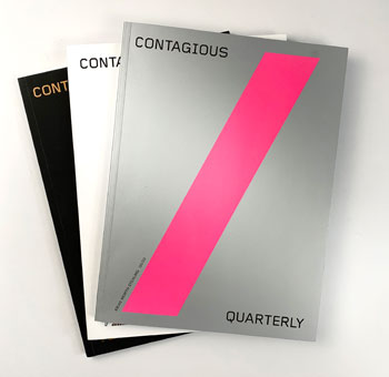
At £250 a copy, Contagious used to be the world’s most expensive magazine. Created by the insight agency of the same name, it was redesigned by me and the team last year.
The new goal was for it to serve as content marketing to a bigger audience of ad executives and c-suite marketing folk.
Previously, it had no coverlines at all. But now it needed to explain itself to an audience who may have never heard of it. It had to demonstrate its purpose, and why it was worth paying attention to.
The Big Fat Promise here is just one tiny line of type — ‘Ideas Worth Stealing’. In just three words, we discover what’s inside, the benefit to the reader, and the values shared by both brand and audience. Quiet, but massive cut-through.
5. Get your cover to feel epic
Epic is defined as ‘heroic or grand in character’. All covers discussed so far meet that description. The reader is always the hero, and the brand always makes their experience feel bigger and better.
But, sometimes, you can make a cover feel epic by using scale.
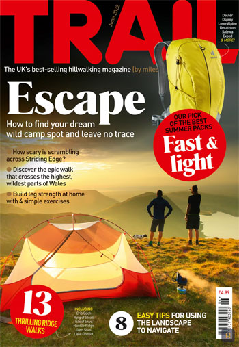
Trail’s covers were redesigned a couple of years back. Our goal was to make the cover feel as big as possible. The logo is always in colour to make it properly part of the picture. Everything then bleeds off, making clear the ambition and scope of the brand.
As befits newsstand, there’s also a ton of value, carefully layered for maximum inhaleability. For 32 issues straight, Editor Oli Read and Art Editor Louise Parker have delivered stunning views, attractive people, and lots of sexy kit. Go check them all out on Readly, and you’ll see what I mean.
And don’t forget:
- Teamwork is critical: A specialist magazine cover is not a collection of parts tipped into a template. It is a whole thing, a single entity. This means the words must be written with the images in view. Like pop music, all the elements need to be mixed in a way that feels clear, simple and memorable. It’s the design itself that creates a single, unifying moment. On Farmers Guardian, the content is gathered ahead of time, then assembled live on Zoom. Editor Olivia Midgley is in charge, with Art Director Mike Begley at the controls, and me on the mic. I might have designed the template, but when the rubber hits the road, it’s always a team effort. And on a weekly, it must be finished in under an hour. No pressure, then...
- Colour control is key: Colour is the most powerful framing device. Black type on white says ‘news’, whilst yellow panels say ‘extra’. The spot silver and flouro pink on Contagious say, ‘the world’s most expensive magazine’. Dark green says ‘farming’, and so on. Your colours need to be chosen wisely, with a clear sense of brand strategy and tactical execution.
- Impact is everything: The famous designer, Milton Glaser, said, “There are three responses to a piece of design — yes, no, and wow! WOW is the one to aim for.”
For specialist magazine covers, that’s where competitive advantage truly lies.
This article was first published in InPublishing magazine. If you would like to be added to the free mailing list to receive the magazine, please register here.