I am sometimes asked by PRs what we magazine editors or journalists would like from them. ‘A decent story, preferably exclusive’ is usually my first answer, or ‘decent quality pictures, please’ or occasionally, ‘comment on the story of the day’. These are all welcome but PR execs, despite what some journalists seem to think, are not there to serve journalists – they exist to serve their employer or their clients and that means they do everything they can to get plenty of positive coverage for them. This means we get plenty of offers, requests and even demands from public relations and marketing departments – ranging from the perfectly nice and reasonable to the ‘you what, you must be joking’ sort of request.
The most common enquiry is whether we received that press release they just sent and whether we intend to use it or sometimes whether we will ‘run it’. Apart from the wrong assumption we ‘run’ press releases which is a little insulting, it’s a harmless enough request and I try to be polite, knowing that it’s a ring-round task for an intern. I politely explain I get hundreds of releases every day and if they sent it, I’m sure we got it but if it makes them feel better they can resend it – strangely it often does.
At the other end of the scale, there’s the insistence that the company must see our story before publication, or even check and ‘approve’ it. That’s something I’ve railed against at more length before in this column but in short, no one external sees our stories before publication.
Others demand the rendering of company or product names in weird and not-so-wonderful ways. There are rules, they say, in how these are written. They seem to think these rules apply as much to our independent publication as to their own brochures or website.
First, there’s the misunderstanding that it’s essential to include those copyright, trademark or registered mark superscripts everywhere. Not so. By all means put them in your press releases to let us know. It’s fair enough to remind us that Sellotape, JCB, Fibreglass, Cashpoint, Hoover or Astroturf are actually proprietary product names and not generic terms. If your marketing rules say you must put a C or TM after every mention, then feel free but it’s not a legal requirement, it adds nothing useful and we won’t be joining you.
They seem to think these rules apply as much to our independent publication as to their own brochures or website.
CAN YOU SEE ME!
Then there are tactics to make the company name or its product stand out. One is to try to insist it is always ALL IN CAPITALS. It stands out alright – it looks a mess – and I’m not sure it really helps the company either. It becomes a tiresome read when that ALL IN CAPITALS product name is repeatedly shouted at you throughout the article. So the answer is ‘no’. But that doesn’t sit well with some organisations’ internal branding police trying to enforce their rules on publishers.
I recall one marketing director who was convinced that shortening the organisation to a TLA – or Three Letter Acronym – would soon make his brand as famous as the BBC. The broadcaster, he explained, does not have to spell out its name and, in future, no one would spell out his client’s either – it would always and solely be known as the TLA. How would he convince all those independent newspapers, magazines and websites, I asked. We’ll just tell them, he said. But sub-editors follow style books, I explained, they answer to their editors, not to any external corporate marketing department. If you don’t spell it out, they will just call you up to ask, or look it up with Companies House, the Charity Commission or other independent official source.
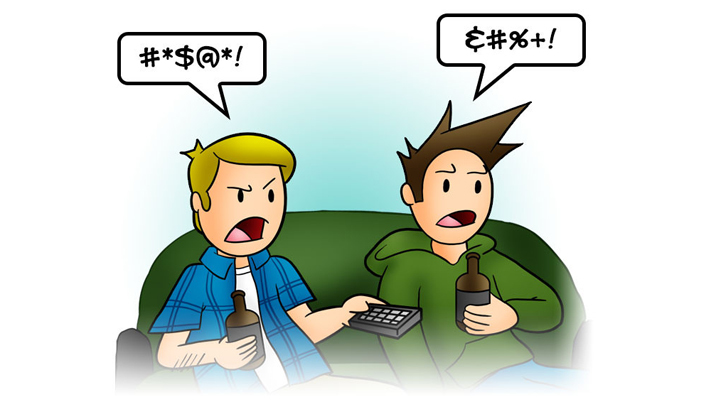
Product names is where it gets really silly. Capitals or special characters appear in the middle of a prOduCt n@me for no reason. Words are underlined, italic or bold. Foreign or obscure characters appear for no reason. Anything is possible. They remind me of the Tintin and Asterisk books and their swearing in symbols known as ‘grawlix’.
I don’t recall insistence upon particular colours or mixtures of point sizes but now I’ve suggested it, it’s probably only a matter of time. The tech world, and the B2B space, are particularly susceptible to this tendency.
But the most famous example was in the music industry and it’s possibly the cool exception that proves the rule. Prince changed his name to a symbol which was obviously unpronounceable and he became instead The Artist Formerly Known As Prince, or TAFKAP. He faced ridicule and it probably affected sales. But, for once, this wasn’t the brainchild of the label’s marketing. It was the opposite: Prince’s own rebellion against his label and what he saw as bad contracts that turned him into a music-making machine for Warner Brothers and the Prince brand that it controlled. After the contract expired, he just went back to being Prince, his point won. This was his two fingers to the label bosses.
For the record...
E&T’s style book and most others will use the commonly known name, capitalised for proper nouns or sometimes for pronunciation where, for example, it’s several words run together to make one proper noun. We do have exceptions like iPhone which just looks all wrong as IPhone. We omit the designations like Corp, Inc or Ltd unless they’re necessary for distinction in, for example, a finance story. And we’ll spell out all acronyms on the first mention except the most common and most famous examples like BBC or IBM that everyone is familiar with.
This article was first published in InPublishing magazine. If you would like to be added to the free mailing list, please register here.


