I’m going to start with something you might not like to hear. It’s this: designing great print magazines and newspapers is almost unimaginably easy compared with the digital equivalents.
In print, you have a fixed page size, whether that be tabloid, Berliner or broadsheet for newspapers and many different ones for magazines, and the elements you can put on it are limited. You have body copy, headlines, standfirst, pictures, a pull-quote or two, maybe even a chart or a box of secondary copy. But that’s pretty much it.
With digital, you have all of the above plus considerations about screen size, whether you want to use video or audio too, or a picture gallery, an interactive chart or graphic. And where to put the calls to action, or CTAs, such as email sign-ups, related links and reader comments.
Not only that but you also have to think about where your article and publication fits into the online life of your reader. In print, the deal is sealed the second someone buys the publication; in digital, you are always working to keep the reader from moving onto something (apparently) more interesting that is just a click away. A reader isn’t “yours” the way they used to be in print.
You also need to think carefully about how the journalistic mission, business model and strategy of your publication affect the way you present your stories to users. In print, you never had to think about what point in an article to encourage readers to subscribe, did you?
What follows comes from more than 25 years of creating newspaper and magazine pages and, more recently, digital news experiences when I was head of digital for The Times and The Sunday Times.
Let’s start at the article level and then work our way up to the wider experience of encountering a news site.
Reader expectations
The first thing to remember actually applies to both and that is to always put yourself in the position of the reader. Think about how they will come across your article and what you can usefully tell them to expect from it.
A key difference from print is that digital readers, whether visiting a homepage or clicking straight to an article from social media or search, don’t know what they are getting at a mere glance of the page. We have to clearly signal to them what they are getting into if they choose to read the article.
Is it a news article that is quick to digest? If yes, then put a clear newsy headline on it. If it’s a bit of analysis or a background feature, then make that clear in the headline or affix a suitable label. If the piece is many thousands of words long and will require a significant time commitment on behalf of the reader, then be sure to tell them about it.
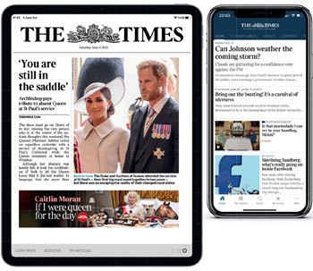
We all know that sinking feeling of looking to the right of an article on a mobile phone and seeing a progress bar that has barely shifted. Make sure your readers don’t feel the same way. After extensive testing with subscribers to The Times, we added a “Long read” label to any story that was more than 1500 words long.
I’m calling them “readers” because still, in 2022, people will mostly come to your website or apps to read text. Video and audio of all stripes have increased their share of user attention, but it remains helpful still to think of your users as readers because that’s what the majority of them come to you to do – for now, at least.
A principle that follows is put as little in the way of their reading experience as possible. Try not to break the flow of scanning an article.
I know that a lot of very popular news websites run three or four lines of text and then a huge picture gallery, followed by three or four lines of text, and then a video, but this is best avoided. Instead, follow the lead of publications like The New York Times, the New Yorker and the Washington Post and prioritise a clean reading experience.
At The Times, when we relaunched our website and smartphone app in 2016, we deliberately removed as much clutter as possible from the run of text. The rationale was that the usual rules of print design – where you had to break up big chunks of text to stop them looking forbidding – no longer applied.
The pull quote: RIP
An example is the pull quote. A useful tool for every print designer, they are an anachronism in digital and I banned their use. Why? Well, in print, they offer another entry point into a page – they are there to stop readers from turning over – as well as breaking up the grey mass of text.
In digital, if you are reading a pull quote you have definitely started reading the article and it’s a fair bet you’ve already read quite a lot of it. You don’t need to be encouraged to read the article, you already are. Even on a desktop web page, the problem of grey slabs of text doesn’t really apply like it does in print.
My views on other page furniture are not quite as extreme as with pull quotes. However, you should think carefully about whether your interruption of the reader is worthwhile, whatever it is. Is this the right time to be offering them another article to read? Is this really the right place to sign them up for an email?
Of course, if you must have interruptions, there is now data that can help you to place them well. That is scroll depth, which tells you how far readers get in your articles. Harness this information and place CTAs at that position in the article. Then you are starting to think of the onward journey of customers.
Wordcount
Before we move on from the make-up of individual articles, a few more general principles. An important one is that article length is not a good guide to reader engagement. I have seen a lot of articles in trade publications over the years saying that “the 500-word news story is dead”, and that, digitally, people read either very short or very long articles.
Nonsense. We found in our data at The Times something that I know others have found too: namely, that readers engaged equally with long or short articles. The key was that the article was something they couldn’t find elsewhere, that it was unique, that it had expert commentary or analysis within it, or that it told a story through an individual. This is perhaps less about a reading experience than a content strategy, but is nonetheless relevant because it’s about meeting your readers’ expectations.
Similarly, headlines must be more straightforward than they were in print, where the whole of the rest of the page and its furniture helped to tell the reader what they were about to read. Now, both for reasons of clarity and search engine optimisation (SEO), they need to outline the who, what, how and where, much more clearly.
A difficult question, but one which goes to the heart of digital storytelling is when to use a video, audio clip, interactive or other “digital gizmos”, as they were once described to me by a print editor. Unless you are going to tell a story entirely in one of these formats, then a useful rule of thumb is that the multimedia asset should enhance the story, rather than simply re-tell it. If the tone of voice someone is using in a speech is telling, use the audio clip, rather than try to explain it in words. If something is easier to explain by watching it happen, use a video. And so on.
How many and when
Okay, so you have the individual articles for your website. What are the rules for how many you should publish, how often and at what times of day?
The answers are different if you are a free or a subscription site, but not that different. The free world has traditionally been governed by volume and the need to signal to Google that you are an authority on a topic by being the first to publish. So get a lot of copy out there and quickly.
However, increasingly, ad-based publishers are realising that they have to engage users more than once to convince advertisers that they have an audience that is worth targeting and not a bunch of one-click wonders. So, they are looking to the tactics used by subscription sites, which have long known that the more deeply you engage readers, the less likely they are to give up their subscription.
How do you do this? First, don’t overwhelm readers with options. They have far too many in the digital world already, don’t add to it. Use your editing skills to cut down the number of stories that your readers must navigate. And make sure that every article on your site is worth reading (and that, if asked, you could articulate exactly why it is).
Four years ago at The Times, I set an arbitrary limit of 40 for the number of stories in the news run on the app and website. This was about 15 below the typical number previously published (and the number published in print). Engagement went up – readers read more articles per visit and stayed for longer. So I cut it by another five. The same thing happened again. This is a story for which any number of publishers, from The Guardian to the New York Times, would have their own examples. Less is better.
If you want to get really advanced, then tailor your publishing schedule to the time of week or day. Swedish publishers have long sought to produce content to give people something to talk about at the country’s universal 4pm coffee break; others have targeted half-time in football matches for stories about individual players.
I went further in introducing edition-led digital publishing at The Times only at set times of day to coincide with people’s wake-up, their arrival at the office, lunchtime and commute home. It led to dramatically increased engagement.
In conclusion, I come back to where we started. The building blocks of digital reading are greater in number than for print. However, if you keep the reader in mind at all points, and are prepared to experiment and follow what the data tells you, then you can build a compelling experience.
This article was first published in InPublishing magazine. If you would like to be added to the free mailing list, please register here.