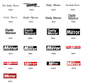
The website and apps have undergone a full design and UX overhaul, with a new framework and cleaner look, giving key stories and images more prominence and bringing brand relevant content to the fore, say the publishers.
Changes to the masthead include a darker red shade and a return to a rounded rather than square dot over the “i”, for the first time since departing from its serif font roots in 1965.
Our new design reflects a warmer, more nuanced view of the world.
Alison Phillips
The work was implemented by Reach’s in-house design, UX and product teams, following in-depth brand strategy work spearheaded by Reach Director of Market Insight and Brand Strategy Andrew Tenzer.
Editor-in-Chief Alison Phillips commented: “The Mirror has been through many changes in its 118-year history, but has always returned to its commitment to providing accessible, entertaining news for the mainstream public with compassion.

“Our new design reflects a warmer, more nuanced view of the world, while putting our readers right in the story.
“At a time when it’s clear just how much people need trusted journalism, I’m excited and hopeful to be launching this next phase for the Mirror.”
Tenzer added: “The news landscape has changed significantly over recent years and the value of a clear brand identity has never been so important. We now have a consistent identity across all channels and platforms, rooted in our positioning as a newsbrand that’s at the heart of Britain.”
The changes come after the Mirror launched its “Mirror More Hopeful” commitment last month, pledging to provide more hopeful, nuanced and solution-based news reporting.
Keep up-to-date with publishing news: sign up here for InPubWeekly, our free weekly e-newsletter.


