Let’s start by agreeing that ‘design’ is a verb, not a noun – it’s a process. It’s not just shapes and colours, it’s about understanding who you are, and then matching your values to those of your customers.
You might have the greatest strategy in the world, but as Harvard Business Review reports, most strategies fail though poor execution. In other words – bad design.
Poor execution may be evidenced by poor pictures, weak layout and all the rest of it, but it’s the thinking behind these choices that we need to look at.
Design decisions do have visual outcomes, but they are essentially by-products. Fonts, colours, graphics, pictures, and logos are all business critical, but they don’t take ultimate responsibility for success or failure.
That lies with the process that determines those visual outcomes in the first place. Good design starts by knowing who the customer really is, and how their true needs will be met.
Good design is the ultimate brand differentiator.
In a world where alternative choices are just a click away, good design is the fastest way to make choosing you a no-brainer. Straight away, good design will let readers, clients, and customers know that they’re in the right place. That they have been seen, understood, and they’re going to get what they came for.
If your content really is one-of-a-kind, then customers sometimes have no choice to stick with you, even if it hurts their eyes to do so.
But in a world where attention is won or lost in an instant, positioning on content alone is not enough. It’s how everything works together that counts.
Good design takes every aspect of your brand messaging, visual identity, tone of voice and actual content, and balances them all into an experience that can be grasped in seconds.
This article will unpack four ‘good design’ decisions that will transform the experience of your brand.
1. Understand who you’re talking to
Everyone can agree that audience insight informs good business decisions. But what does that ‘insight’ mean in the real world, and what has design got to do with it anyway?
Good design is all about absolute priority, never a list of priorities. Businesses love a spreadsheet of all the things they want to accomplish, but this approach dilutes resources and lacks focus.
Good design is powered by the one business goal that stands above all others. This process can be painful, because to quote David Ogilvy, “strategy is sacrifice”.
Then comes the equally challenging question of the customer.
Media brands are all about emotional engagement. And emotional engagement can only be created at a personal level. When the great Terry Wogan was asked how many listeners he had, quite rightly, he said: “One”.
It’s never a question of excluding people, but to hit the target you have to aim at the very centre of the bullseye. Identifying your audience as ‘millennials’, ABC1, or ‘people who like fishing’ is all very well, but not nearly good enough.
Good design is about naming this individual, giving them an age, and painting a picture of every single thing about them.
For example, last year we were commissioned to design a specialist iPad app for anaesthetists. The product was a massive data cruncher that predicted haemodynamic stability under keyhole surgery, but that aside(!), to pick the right colours and fonts, we needed to know exactly who would be looking at this thing.
Because brands only ever exist in the mind of a customer.
Our client insisted the anaesthetist would be a man. He was named as Hugo, 46 years old and living with his second wife Emma in Burbank, California. So far so good, but the question that determined the design direction was, ‘what car does he drive?’
Much like supermarket brands, cars are perfect avatars for a whole set of hard-to-describe values. We might have expected anaesthetists to drive a BMW or a Volvo.
But no, they drive Lamborghinis.
In just one moment, the design direction became crystal clear. This product needed to reassure the user in exactly the same way as looking at a Lamborghini dashboard. Decisions about colours, fonts, and illustration now had something tangible to be measured against.
2. Know what makes you distinct
Just three seconds. That’s how long you’ve got to make an impression. Get it right now and your audience will be engaged by everything that follows. This means show first and tell later.
Let’s agree that reading is hard work. People just can’t wait to bail. I’m sure half InPublishing readers will never get this far. But conversely, I can also tell you that every single person will have read all the picture captions. Images may be a brand’s airforce, but captions are the infantry, engaging your audience one word at a time.
Customers have to be treated as viewers before they can become readers.
In a visual world, one can argue that alongside images, it’s colour that operates on the psyche before anything else.
Font choice will modify the feeling of a colour but never eclipse it. The NHS logo is set in an exciting italic sans serif, but it’s the safety of the deep blue that people recognise and remember.
Colour contains vast amounts of mood-altering data, so if we want to engage on an emotional level we need to choose well. Want to communicate that your brand is ethical? Choose green, like Whole Food Markets. Alternatively, if you want to communicate modernity and digital zip, choose flouro orange, like Monzo bank.
In the wider sense of the word, colour is also delivered by font choice. Operating at the most granular level, the typeface you choose informs every single word you write. Typography is a dark, dark art, but at the end of the day, there are only three fonts to choose from – serif, sans serif and slab serif.
Check out the comms of these three car brands and you’ll see what I mean.
- Serif = superiority = Mercedes
- Sans serif = excitement = BMW
- Slab serif = safety = Volvo
Using only one font is clear and disciplined, but media brands are powered by content, so carefully chosen pairings are needed for different sized messages.
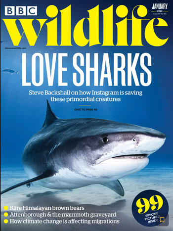
For example, in our recent redesign of BBC Wildlife, we chose Manuka, an exciting sans serif for the splash headlines, and Stag, a safe and stable workhorse slab to deliver the smaller lines. But the big call was to draw a new logo in a superior serif, moving the brand upmarket, driving yield, and allowing the brand to attract high-end advertisers. It’s worked; in the months after the new design, newsstand went up 26%, subs went up 10% and high-end optic brand Zeiss appeared in the mag for the first time.
3. Make a great promise
Pictures create an emotional response, but to crystalise the story, good design requires good headlines to move it on and prove that the brand promise will be kept.
Headlines are how you join everything up across every platform. It’s your tweet, your email subject line, and your soundbite. It’s also how you measure success. Good headlines get customers to stay longer on a page, click the next link, share the story, sign up for a newsletter or best of all, reduce churn by getting them to the retention point – the moment when they decide that they can never ever afford to be without this magazine subscription.
Headlines must always be written with the image they accompany in view. It doesn’t matter who writes them, but good design cannot be delivered with passive language, meaningless puns, or pointless alliteration.
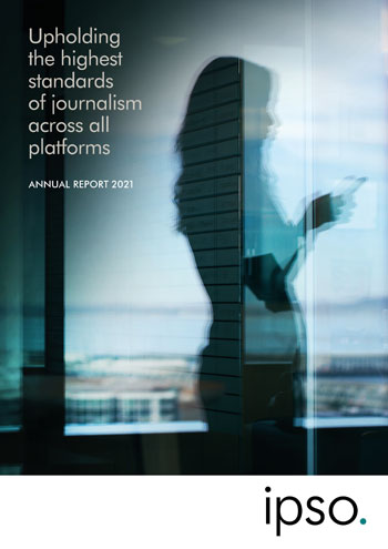
Remember, headings are not headlines. In our new design for the 2021 IPSO annual report, the heading is just that, whereas the headline is ‘Upholding the highest standards of journalism across all platforms’.
4. Keep people coming back for more
Getting people through the door is essential, but after that, how do you get people to stick around?
Firstly, don’t take the piss. And by that, I mean set the type too small. For example, look at news weeklies on mobile. All may be high-quality brands, but with the honourable exception of the The New Yorker, all the type is small and hard to read. With endless space available, there is literally no reason for this. It’s bad design, as not enough customers in the purchase funnel will ever get to the point of payment.
Good design is about respecting your customer, supporting their sense of identity, and making content appear effortless to consume. But it’s also about ‘hidden hooks’.
More than just treatments, hidden hooks are super sticky, compelling experiences that customers know will always be there. Famous examples abound, but include Men’s Health’s Belly-off-club, Oprah’s Aha! Moment, The Big Issue’s Vendor Diary, and Private Eye’s Great Bores of Today, Colemanballs, Street of Shame and many more.
Large or small, hidden hooks should go to the very heart of brand DNA. Good design is about placing these franchises in the mix so that they become completely synonymous with the title.
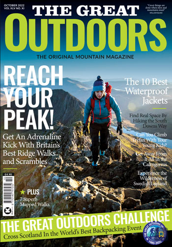
Sometimes it’s just an ever-present coverline. For example, in our recent logo and cover redesign for The Great Outdoors, in the top right corner, there will now always be a tiny, but epic moment of mountaineering wisdom.
Whereas in our recent logo and cover redesign of The Country Smallholder, the words ‘Free Vet Advice’ will now always appear in the top left. For people who keep chickens, if that’s not a reason to subscribe, I don’t know what is.
This article was first published in InPublishing magazine. If you would like to be added to the free mailing list to receive the magazine, please register here.