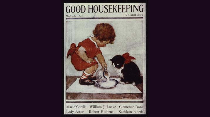
Buried in my treasured collection of classic magazine covers is a pre-war copy of Good Housekeeping. There are no coverlines and no unseemly sales messages tarnishing the Jessie Willcox Smith illustration. With the possible exception of the list of contributors, there is no attempt to persuade or bribe the target reader to pick up a copy and take it to the cash till.
Fast forward to Good Housekeeping, August 2005. Carol Vorderman reposes on a white background in a multi-coloured frock, a wind-machine giving her hair an outdoor, ‘natural’ look. Ten coverlines tick all the boxes to intrigue the potential buyer. There’s a free paperback, a no-diet diet, and a 1000-reader survey on hormones, husbands and hunks.Today’s magazine covers are prime weapons in winning the sales war; more effective, I would argue, when well executed, than a bulging budget’s worth of above-the line marketing.
An effective, compelling cover can push up sales by 20% or more, assuming a level playing surface where there is no competitive marketing activity. Consistently good covers (supported by editorial that truly delivers the coverline promises) are probably the single most cost-effective, long-lasting, brand-enhancing way to ABC stability or growth.Covers are best thought of as examples of sophisticated package design.
The ‘bagazine’
In many markets, of course, covers are now so much more than a well-designed front page; the ‘bagazine’ is here to stay and news-runs can look more like car boot sales as publishers bolt on goody-bags of flip-flops, paperbacks, bikinis, computer games, day-glo crayons and sexy wheel nuts. This gift activity can seriously distort the effectiveness of a well or badly designed cover, but in the end it’s the total package, gift and magazine combined, or magazine on its own, that’s shouting from the shelf, ‘Buy Me’.
Today’s covers, with or without gifts, are best thought of as examples of sophisticated package design. In training workshops, I often suggest to publishers that they should hire packaging experts from other FMCG industries to teach them the principles of wrappers that sell.
In just about every magazine sector, today’s readers are no longer brand loyal. In cut-throat weekly markets like celebrity or real life, in women’s monthly glossies, in the teen and games markets, promiscuous readers will brand switch at the sight of a sexy celeb, a diet coverline, a competition or a cover-mounted sarong. And they’re getting into the habit young; pre-school publications like Bob the Builder or Thomas and Friends use well planned cover gift strategies to persuade three-year-olds to change brands.
Covers are frighteningly subjective.
Printers can help & hinder
Flashy production techniques are also playing their part in selling covers. Multi-choice covers (see Radio Times, below), the use of flag-flaps and gatefolds, or the regular recruitment of a fifth colour or metallic – now a feature of the weeklies market and not just the posh glossies - can add tremendous zing to the front page. Not forgetting special techniques like Rugby World’s embossed cover to celebrate the last Rugby World Cup, and lenticular (holographic) covers from Empire and NME in 2004. But publishers should always be cautious of printers bearing gifts. A recent cover of Woman magazine used a metallic sage green for the logo and some coverlines. It looked smart in the right light, but on most newsstands it looked murky, grey and recessive. And last Christmas’s issue of New Woman involved overprinting the logo and part of the cover in what looked and felt like glitter trapped in dried treacle. Undoubtedly expensive, but I would say ineffective and costly as a sales tool. Yes, ugly too.
Quality gifts and sophisticated production techniques will all play a part in shifting copies in highly competitive markets. But the most reliable way to sell covers is startlingly simple; first accumulate strong editorial content, and then spend an obscene amount of time working out how best to sell it – market it - on the cover with strong images and great coverlines. Too many editors, especially in some special interest and business markets, leave cover planning to the last minute, crashing it together with the art editor as deadlines loom. Bagged issues need the same amount of meticulous planning, selling the supplement or gift for all its worth and not forgetting the magazine content. In some publishing houses there is still tension between marketing and editorial departments when it comes to the critical job of designing bags; in my view ownership of the bag lies with the editor, directing the art editor to tread a perilous tightrope – retain the brands values, but sell, sell, sell.
The best selling covers are crafted on day one, at editorial conference stage, where the cover is planned alongside content. Some editors won’t even listen to a feature idea unless it’s accompanied by a potential coverline. This is a great way to raise everybody’s game, and it has the effect of putting the cover at the top of the editorial agenda, giving editors a wealth of choice when it comes to selecting balanced exciting, varied content to sell on the front page.
You can’t make a great cover from crap content.
Saturday in Tesco
For an editor, putting together a magazine cover is the scariest job in the world. These days, the cover often has to run the gauntlet of managing director, publisher and marketing manager before getting the green light. And even then, sales monitoring will give editors sleepless nights as patchy data suggests that their latest cover has failed to set the world on fire. Covers are frighteningly subjective; I have seen cover strategies torn to shreds on the whim of a publisher who thought a cover looked a bit tame when they went shopping in Tesco on Saturday morning, or on the circumstantial evidence of a circulation executive who picked up vibes that a couple of retailers didn’t think the cover had much ‘bite’. Creating good-selling covers on a regular basis needs to be done rationally, calmly, and scientifically. In an ideal world, the wider publishing team defines and agrees a cover strategy, and the editor is turned loose to deliver on that strategy.The winners are those who take calculated risks.
The six principles
I believe there are six solid principles of great selling cover design, all of which should be built into a magazine’s cover strategy. They are the six I’s : irresistibility, identity, image, impact, in-it-for me, and innovation.
- Irresistibility means ensuring that the magazine itself contains compulsive content. You can’t make a great cover from crap content, so the editor’s task is to think ‘cover’ from the planning stage and to plan the cover design as far in advance of publication as possible, changing, experimenting, improving, tweaking along the way.
- Identity is about retaining a magazine’s brand values, issue after issue, in the style, feel and emotions generated by the cover. Typeface, colours, number of coverlines and the whole personality of the cover need a consistency and constancy that reinforces the whole temperament of the brand.
- Image means the main image, because this is the first thing consumers see when they walk into a store. Second-rate images, poor lighting, dark pictures, faces that lack spark and inspiration; miserable-looking people, out-of-date celebrities, the ordinary and the lifeless, they won’t sell magazines. There are pictures that work well inside to illustrate a story, and there are cover-worthy pictures … there is a world of difference between them.
- Impact is vital in competitive markets, and those covers that can have more shelf-shout than others will sell more copies. Impact is about having the courage to use eye-catching pictures, strong type and colours and to stand out from the crowd. Good editors will set up their own ‘impact test’ in their office, re-creating a newsstand of competitive titles, and scrutinising objectively a proof of their latest cover in the context of their market.
- In-it-for-me is all about reader benefits. Most people buy magazines to feel good about themselves, to help them through their lives, or to enhance their personal passions and hobbies or their working life. Good covers always offer benefits, whether it’s money off at a big clothes chain, a new diet, 10 ways to improve your sex life, or 50 Playstation cheats.
- Innovation is the art of doing something different. The danger of working in a competitive world is that magazine editors and publishers, fearful for their jobs, play safe, only do the tried and trusted. But the winners are those who take calculated risks; only through trying something new – and making some mistakes - do magazine covers shine brighter than the rest of their market. A weekly editor produces 50 covers in a year – plenty of scope to experiment with new approaches. Even a monthly title can construct a covers policy that combines, over the year, cover-mounted gifts, hard-selling covers with exclusive content and covers that dare to boldly go where no one went before.
The rules of the innovation game must be clear; we make progress with covers by experimenting with fresh ideas and building our knowledge of what works in our market. Celebrate those covers that get the cash tills ringing, but recognise the learning value of the ones that fall flat on their face.
They are both champagne moments, because with covers, we learn just as much from our mistakes as from our successes.
The best selling covers are crafted on day one, at editorial conference stage.


