
Dazed
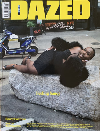
What’s it about: ‘The most influential independent fashion and culture title in the world’ – confident assertion on website.
Vital statistics: Autumn 2022 issue: 322 pages of 298mm x 228mm. Quality gloss paper, card cover, perfect bound. £5.99 cover price. Published quarterly by Waddell Limited in London, near The Strand.
Cover: Full bleed picture of Florida rapper Saucy Santana reclining on a rock in a little black dress beneath the one, understated, coverline. Highlights to inside in tiny type with more names mentioned on the generous spine.
Content: A who’s who of upmarket advertisers before a page of contents detailing 30 items, complete with page numbers to help navigation, although numbers on pages are rare. It’s difficult to overstate the richness and range of content: architecture, photography, a ‘trip’ to Europe’s first psychedelic research lab, music, a magic school in South Africa, in-depth interview with a travel blogger, space travel, fashion photo assignments and Q&As with ‘creative icons’ have the As creatively handwritten, offering an engaging insight into these characters.
Digital: Website at dazeddigital.com has generous content under headings such as Fashion, Beauty, Art and Film. Links to Facebook, with 1.1m likes, and Twitter (1.2m followers) along with TikTok, Instagram and a YouTube channel.
What they say: “We are never bored or apathetic, instead we are constantly energised by new ideas, new platforms, and a total belief in the power, attitude, and politics of youth” – from About on the website.
Verdict: From the gatefold ad attached to the cover (Gucci, of course) through to the made-up horoscopes on page 316, this distinctive, eclectic, adventurous tome has readers hooked on a rollercoaster ride through everything you can possibly do on a printed page. Some, er, creative typography can be difficult to follow and the dizzying array of alternative photography stretches credulity at times, but this magazine knows EXACTLY what it is doing.
frieze
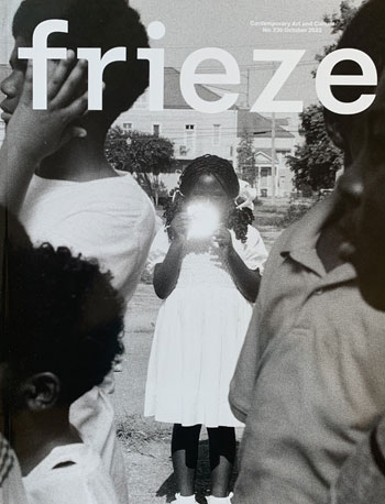
What’s it about: ‘Contemporary Art and Culture’ in tiny type above the masthead and ‘Bringing together the global art community since 1991’ on Instagram.
Vital statistics: October 2022 issue: 210 pages of 300mm x 230mm. Matt paper, gloss card cover, perfect bound. £9.95 cover price. Published eight times a year by Frieze Publishing Ltd in London.
Cover: A full-page black and white photograph which we later learn is called America, by film-maker Garrett Bradley, who is featured inside. Elegant masthead.
Content: Two pages of contents, a page of contributors, the Editor’s Letter and a roll call of frieze staff before the actions starts with some serious artistic appreciation. A breath-taking array of high-end gallery advertising before ‘Features’, which include a profile of the cover picture maker, a run-down on four new galleries in London, an interview with renowned artist Barbara Chase-Riboud and an ‘essay’ about the 1992 Kate Bush album, The Dreaming. ‘On View’ is 16 pages of international listings of galleries. ‘Reviews’ are just that, but are so comprehensive they have their own contents pages detailing more than 20 individual reviews.
Digital: Website at frieze.com had features, interviews, reviews and a ‘latest’ section with exhibitions and opinion columns. Opportunities to listen to podcasts and watch videos as well as access social media with 283.5k followers on Twitter, 146k likes on Facebook and a cool 1m followers on Instagram.
What they say: “And we hope you like the new look. A new typeface – Rhymes by Jakub Samek – is complemented by Swiss 721, a 20th-century sans-serif classic, and wider margins make for an easier reading experience” – editor-in-chief Andrew Durbin turns to the typography playbook for his ‘Welcome to the New Look of Frieze Magazine’.
Verdict: The straightforward editorial pages almost come as relief from the dazzling display of international gallery and exhibition ads that make up a healthy proportion of this unashamedly erudite and high-end publication. Now comfortably into its third decade, it clearly knows what it’s doing.
i-D magazine

What’s it about: ‘A global platform for emerging talent, i-D celebrates fashion, culture, individuality and youth’ – from ‘about’ on a LinkedIn page that has 130,000 followers.
Vital statistics: Winter 2022 issue: 338 pages of 300mm x 230mm. Quality matt paper, card cover, perfect bound. £7.00 cover price. UK circulation of 39,070 according to media pack. Published quarterly by Levelprint Ltd in Hackney, East London.
Cover: Full bleed picture of queen of rap Nicki Minaj beneath the one-word coverline – royalty – and that distinctive masthead. The 18mm spine has room for some content promos and even the barcode.
Content: Big name ads (Chanel, Cartier, Jimmy Choo etc) before a list of 24 inside pieces on page 27, which the editor’s letter tells us ‘create an album’. The list of A-listers include a lavishly-illustrated Q&A with Stormzy, similar treatment for covergirl Nicki complete with typically provocative pictures in a bodysuit. ‘Lost in music’ celebrates the return of nightclubs with 18 pages of pictures while other generous stories traverse the globe from Bangkok to Botswana via Sao Paulo taking in music, fashion and all points in between. Much of the photography is in moody monochrome; plenty of photos, some risqué, some bizarre but always artful.
Digital: Shares a website with Vice magazine at i-d.vice.com but also a wealth of its own content including up-to-the-minute news, art and music. Links to Instagram, with 2.2m followers, and TikTok with 446.2k followers. Find your way to Twitter and join 1.5m other followers and 1.37m likes on Facebook.
What they say: Rick Rubin (interviewer): “Yo! How are you feeling man?”
Stormzy: “I’m feeling good! It’s an honour to talk to you. It’s a real pleasure. God bless.” Two giants of hip-hop square up with the pleasantries before their interview.
Verdict: All type is plain black on plain white and the four-column plain text with long paragraphs can feel a bit clunky. But who cares? This is an homage to a free-thinking, free-spirited world and the high-finance of magazine design can be left to the art-house trendies. Oh, hang on, they are probably readers too…
Konfekt
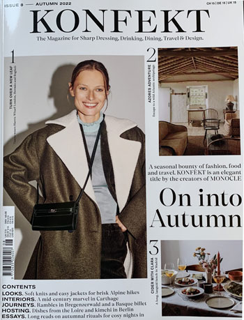
What’s it about: ‘The magazine for Sharp Dressing, Drinking, Dining, Travel & Design’ – tagline under the masthead.
Vital statistics: Autumn 2022 issue: 188 pages of 300mm x 230mm. A mix of quality gloss and matt paper, card cover, perfect bound. £15 cover price. Published quarterly by Winkontent in Zurich, Switzerland with an office in London.
Cover: Pictures of a woman, wearing fall fashion from Prada, an ‘adventure escape’ room in the Azores and a table of food, which is a ‘long, languid lunch in Madrid’, all draped around the coverline ‘On into Autumn’. Five contents promos and a reminder of the cover price in eight worldwide countries.
Content: Ads to die for followed by Editor’s letter on page 15. ‘Welcome’ has a useful map to show the global spread of material and then more traditional contents pages taking in Travel, Drinking & Dining, Design, Fashion and Regimes (artistic, not political). Travel is a giddy trawl around Munich, Naples, Bangkok, Graz, Lyon and Charleston. Natty headlines such as ‘Tweed Dreams’ follows some weavers at work, ‘Sketch in time’ looks at a landscape painter in Hong Kong and ‘Ferment to be’ is about Korean cooking. An ambitious five-way Q&A about the future of craftsmanship zips along together with recipes, wine appreciation, home designs and oodles of fashion.
Digital: Website at konfektmagazine.com, which exhorts browsers to Read, Listen and Purchase. Find your way to Instagram for 12.3k followers, a Twitter page was originated in October 2020 but no activity has taken place.
What they say: “We go behind the scenes to showcase the making of the magazine and to shine a spotlight on Konfekt’s chic understated glamour, convivial hospitality and sense of discovery” – introducing ‘Inside Story’, a sumptuous three-minute video on the website.
Verdict: Long reads interspersed with dip-into pages, all elegantly designed and illustrated. Such a breadth of content, readers will find it irresistible not to keep turning those stylish pages.
Tank
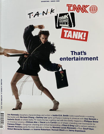
What’s it about: “Show don’t tell” on the spine.
Vital statistics: Autumn 2022 issue: 306 pages of 230mm x 300mm. Quality matt paper, woven card cover, perfect bound. £10 cover price. Published quarterly by Tank Firm Ltd in Great Portland Street, London.
Cover: Picture of a person being dragged off the page by their belt. No fewer than four small mastheads on stickers and the coverline ‘That’s entertainment’. Twenty names pulled out in bold in a wordy panel at the foot of the page.
Content: Editorial kicks off on page 34 with an unexpectedly prosaic Editor’s Letter followed by a spread on contents divided into Front, Features and Fashion amongst other offerings. A 16-page fashion picture-led essay sets the tone before ‘The entertainment issue’ gets its big introduction on page 107. A feature on Superheroes, illustrations from ‘An atlas of LGBTQIA+’, a retrospective on TV newsroom design, an author Q&A with the editor and the life and times of ‘K-pop and soft power’ are among the offerings breaking up the fashion spectaculars. A surprising collection of 10 double-page in-depth interviews – including one with Michael Leggo, the man who brought us Mr Blobby – provide a conclusion to savour.
Digital: Website at tankmagazine.com has magazine content plus multi-media offerings via podcast and Tank TV, which is a selection of curated videos. Click through to Facebook, with 42k likes, and Twitter (28.9k followers) and 82.4k followers on Instagram.
What they say: “Though the details change, the violence is the same, and erupts from the same sources as in the Greek plays: jealousy, anguish, insanity, privation, trauma, the heedless impulsive choices of the gods” – part of a four-page sociological thesis on ‘that’s life’ magazine.
Verdict: Two loosely inserted pages of stickers, with more mini-mastheads, just about sum up this eclectic magazine: unexpected and unexplained but thoroughly well-executed to bring surprise and delight.
The Face
What’s it about: ‘The clothes. The politics. The attitude. The romance’ – descriptor on Instagram.
Vital statistics: Winter 2022 issue: of around 300 pages (there are few page numbers) of 300mm x 230mm. Quality gloss paper, card cover, perfect bound. £9.95 cover price. Published quarterly by Wasted Talent Ltd in London.
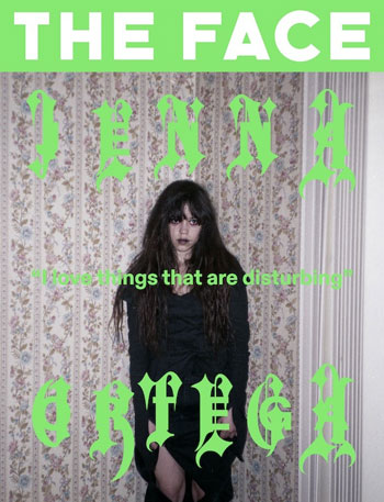
Cover: The words ‘Jenna Ortega’ is a bizarre gothic typeface that is almost impossible to decipher over a picture of “the freakishly fantastic star of Wednesday, Netflix’s Addams Family reboot” and one coverline.
Content: Editor’s letter kicks things off on page 22, but there is no contents page so numbers on the page seem an unnecessary distraction. So, pile in to devour what’s on offer, much of it in black type on a lurid green background. The cover story is a stream of consciousness Q&A interview interspersed with fashion shoots. There are pieces on, by or with relationship sexpert and podcast millionaire Alex Cooper, Skillibeng, ‘the hottest name in dancehall right now’, 17-year-old Lord of the Rings actor Tyroe Muhafidin and an exposition into sleazy TV, angled on Lily-Rose Depp’s new show. Mostly page after page of artfully bizarre photos of people in various stages of undress and fashion shoots that include people with no fashion, ie naked.
Digital: Website at theface.com has much newsy content that is slightly easier to follow than the printed magazine. Click through to Twitter, with 10.4k followers, and Instagram, where it’s at with 176k followers.
What they say: “Trust your instincts. And doubt your instincts. It keeps you honest” – editor Matthew Whitehouse shares his ‘advice for somebody wanting to launch their own publication’ on magculture.com
Verdict: Sometimes impenetrable with letters from headlines jumping across the page and type set at every possible angle, this reboot of THE style magazine of the 80s is impossible to constrain with any traditional definitions. And hurrah to that!
This article was first published in InPublishing magazine. If you would like to be added to the free mailing list to receive the magazine, please register here.


